
Dining Room Update
Interior design has aways been a passion of mine. When I was a little girl, I would play with my dollhouse for HOURS rearranging the furniture. And creating Barbie mansions using my hula hoop for the pool and oversized seashells as floaties for the Barbies. I, for sure, got this love for interior design from my mom. I remember my mom always rearranging furniture and cleaning the house to make it feel fresh and new. And she still does it! Every time I got to her house it looks a little different ha. I think it’s a big stress reliever for both of us. We are an OCD kind of family. 😉
As much fun as I have with interior design, it can be so hard! I will spend hours trying to make one design decision which is why I could never be an interior designer. For me, it’s a lot harder and more time-consuming than putting together a styled outfit. I think the challenging part is the investment. Things like furniture cost a lot of money, and it’s scary to take a risk and buy a piece that you won’t really know you like until it’s in your space (and the money out of your account). That’s why I love finding products through other bloggers or working with interior designers whenever possible.
I’m ESPECIALLY amped to share our dining room update with you guys, and the reason is that I designed it myself. So keep in mind I am not an interior designer, but I am in love with the way it turned out. The room feels finished and cozy, and it has good vibes. Especially the gallery wall! It makes me so incredibly happy every time I look at it. But more on that in a bit! Make sure you scroll all the way to the bottom.
{photos by Vincent Elejorde}
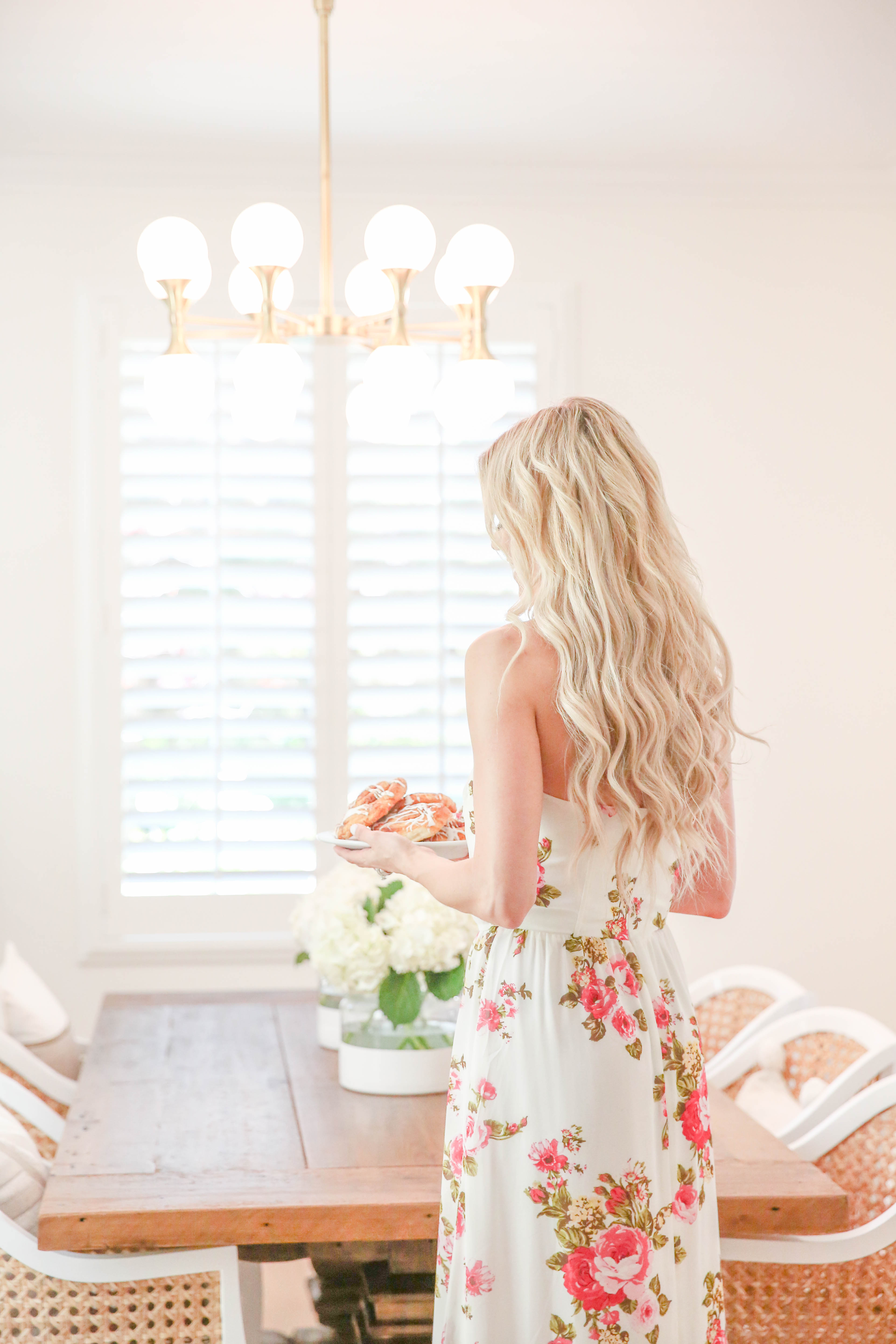
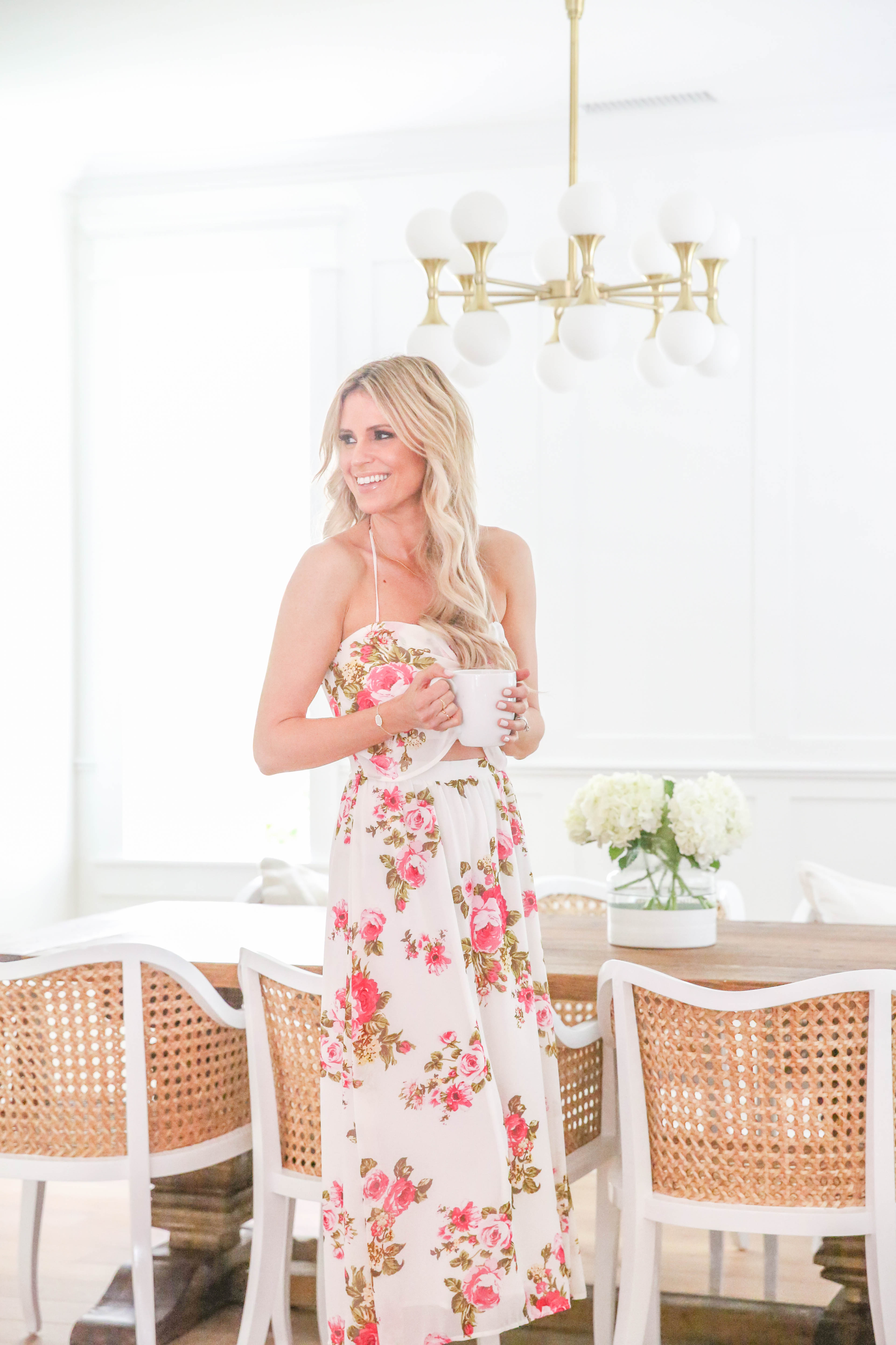
dress: WAYF Floral Print Halter Midi Dress c/o | chandelier: Hudson Valley Lighting c/o | dining table | cane chairs | gallery frames | throw pillows here and here | tree basket
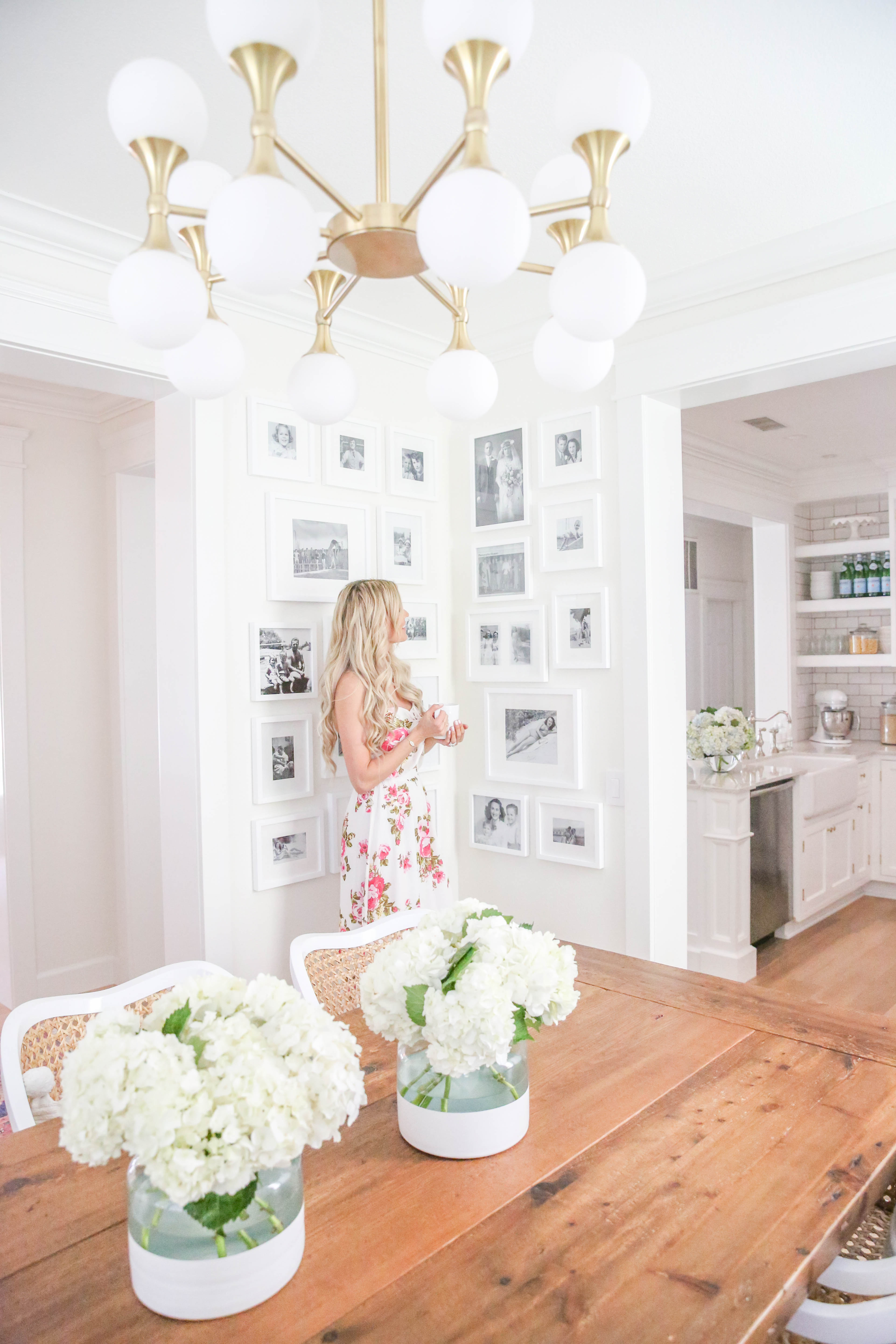
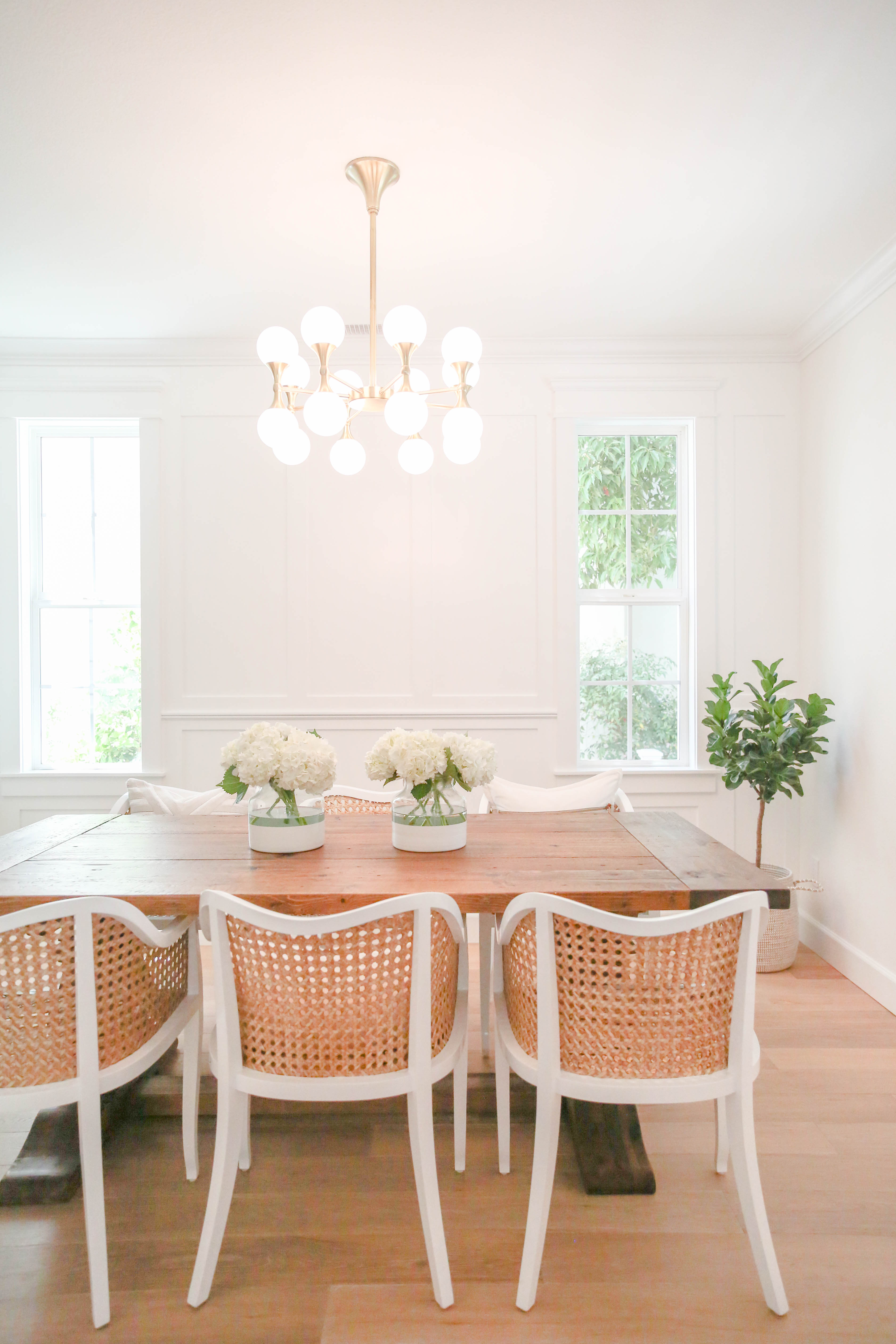
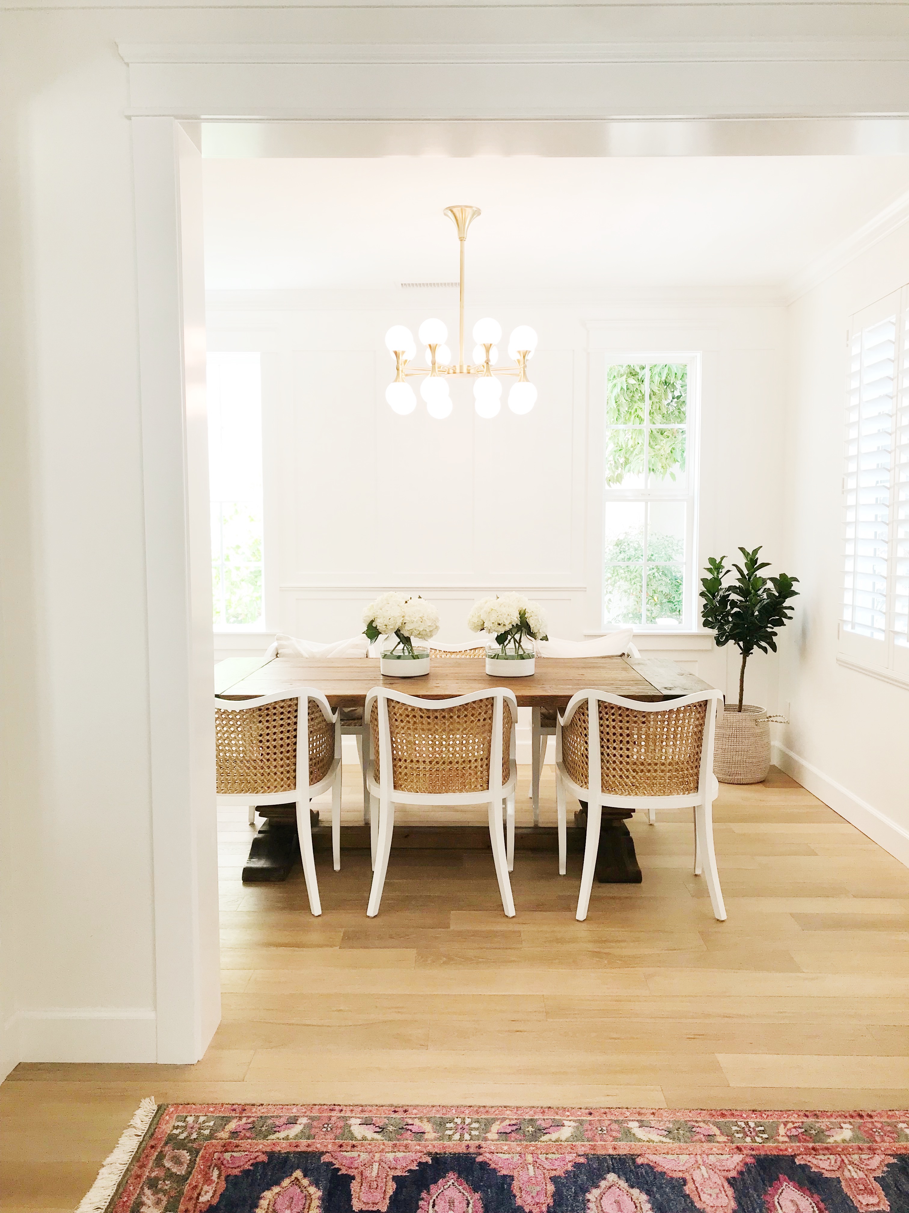
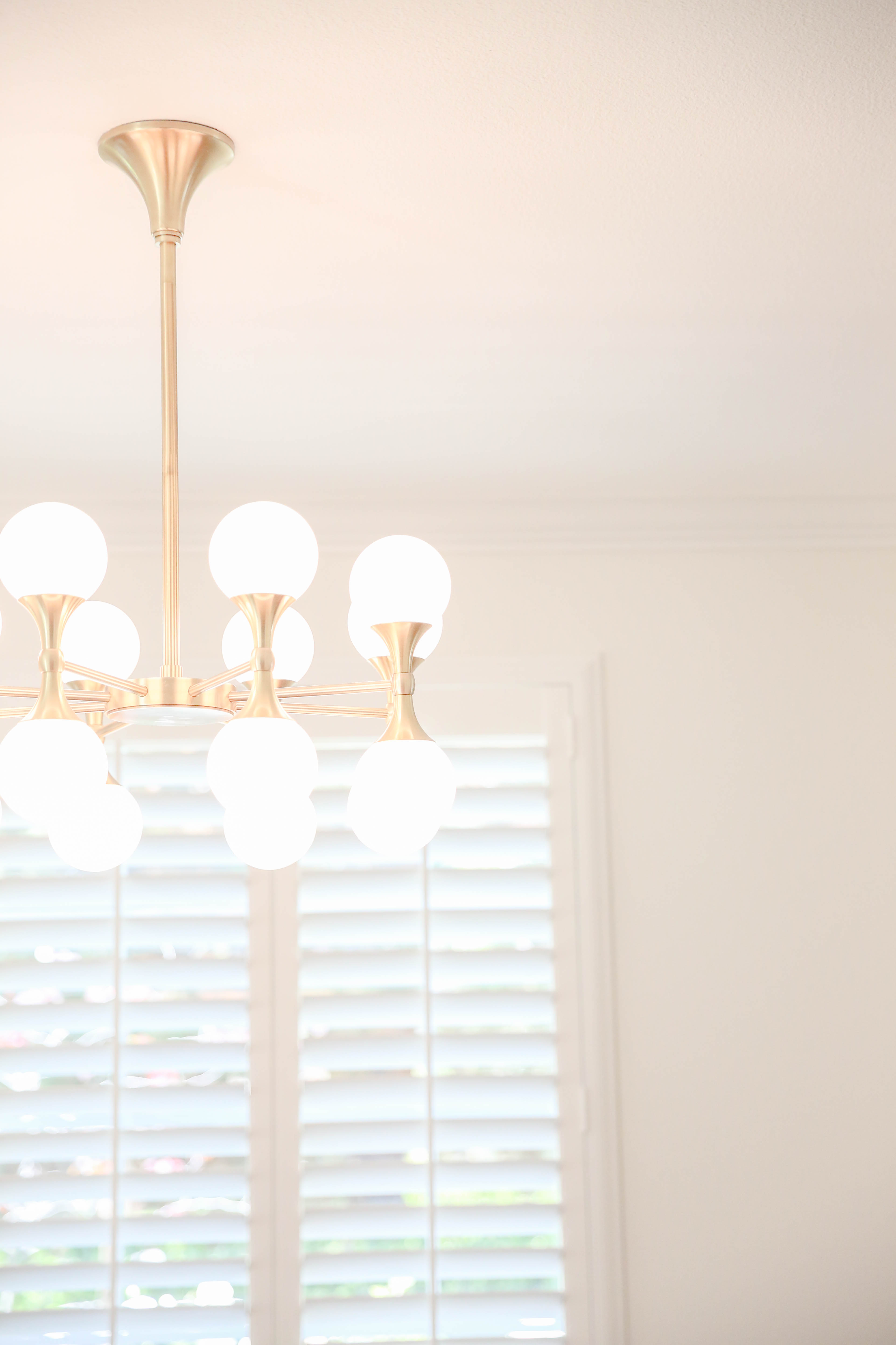
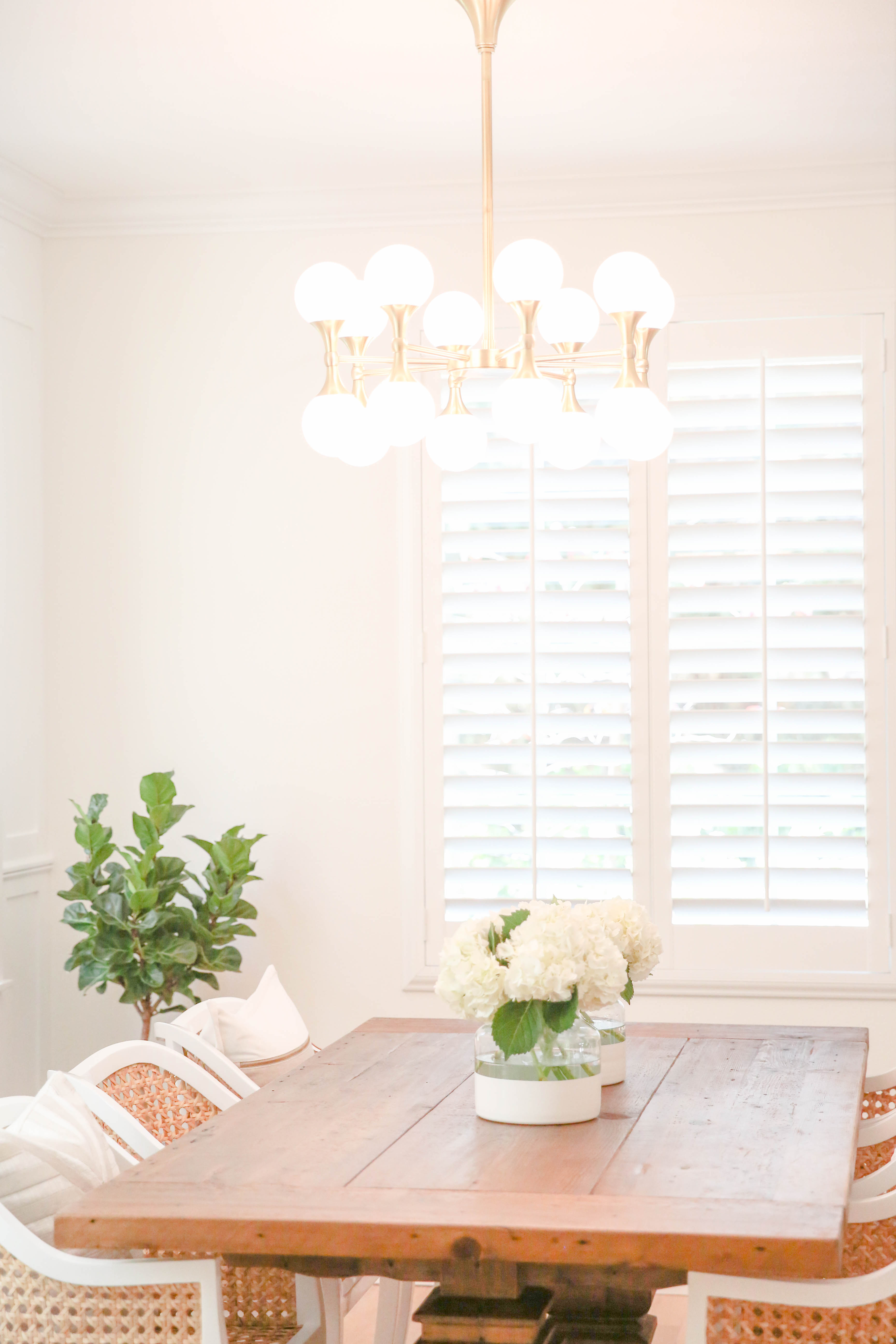
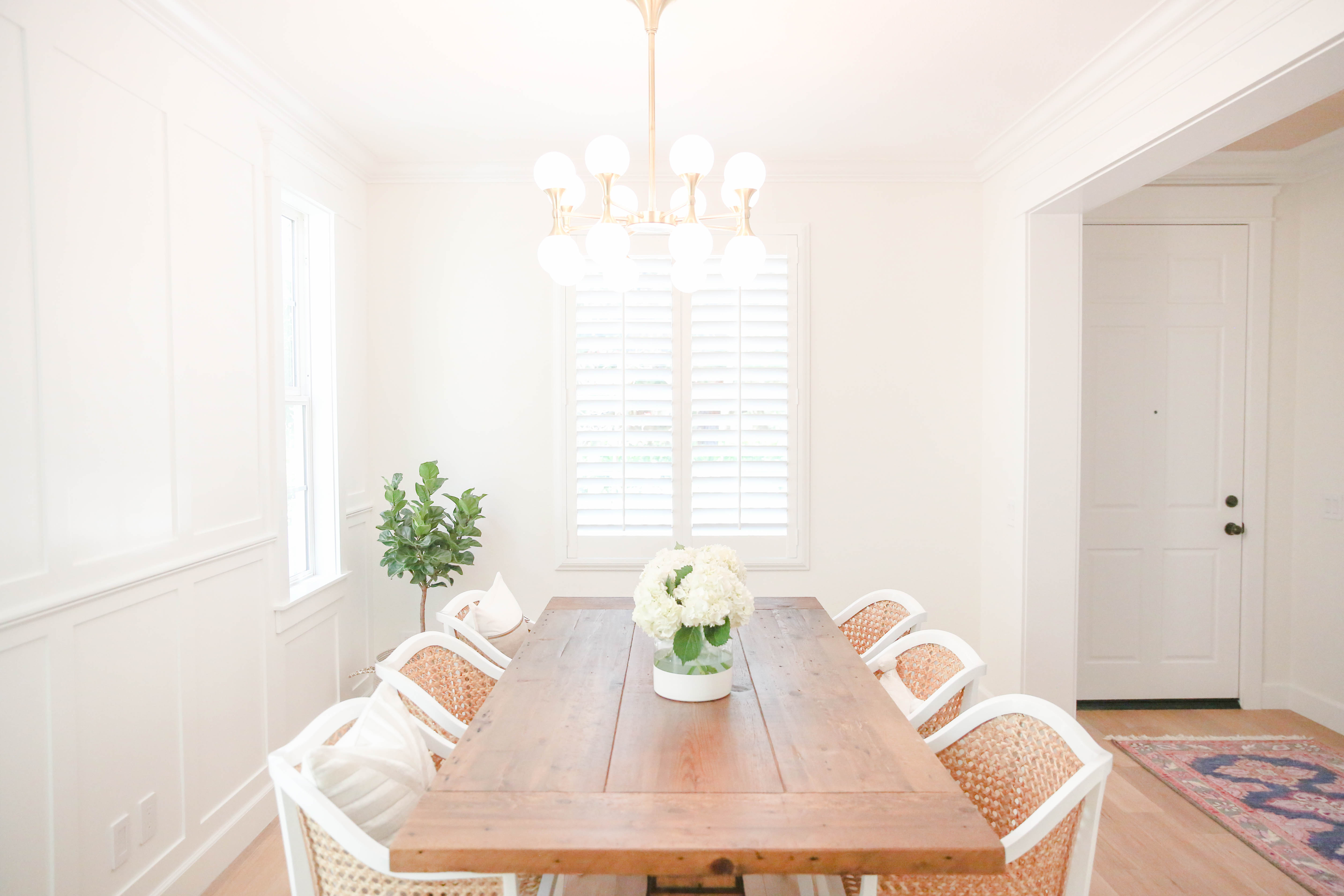
We have been meaning to update our dining room for some time, but we finally got inspired and motivated because of this beautiful statement chandelier from Hudson Valley Lighting. I mentioned that it can take hours for me to pick out one design element (just ask the sales people at Serena + Lily in Newport), but it was love at first sight with this chandelier. It is such a statement piece, and it literally looks like jewelry!
We have almost all our light fixtures on dimmers. This light fixture gives off so much light it’s amazing. I can have it on the lowest setting and it is still brighter than our old West Elm light fixture and uses less energy. If you don’t have a dimmer in your dining room, I strongly suggest. I am always adjusting our lighting around the house. At the end of the day after I’ve cleaned up dinner, I start up the dishwasher (best sound ever!), adjust the dining room light on the lowest dimmer setting, light a candle, and pour a glass of wine… and just enjoy those few kidless hours before I pass out.
As you can see from the photo, our home has *almost* an open layout. Although the rooms are separated by walls, the walls have larger openings so it still feels open. Because the rooms flow into each other, I try to be aware of the adjoining rooms when I design so it doesn’t clash. I’m mostly into neutrals with pops of color so it usually works out. I am also into less is more. I don’t like it to feel too busy. Unless it’s organized busy like the gallery wall.
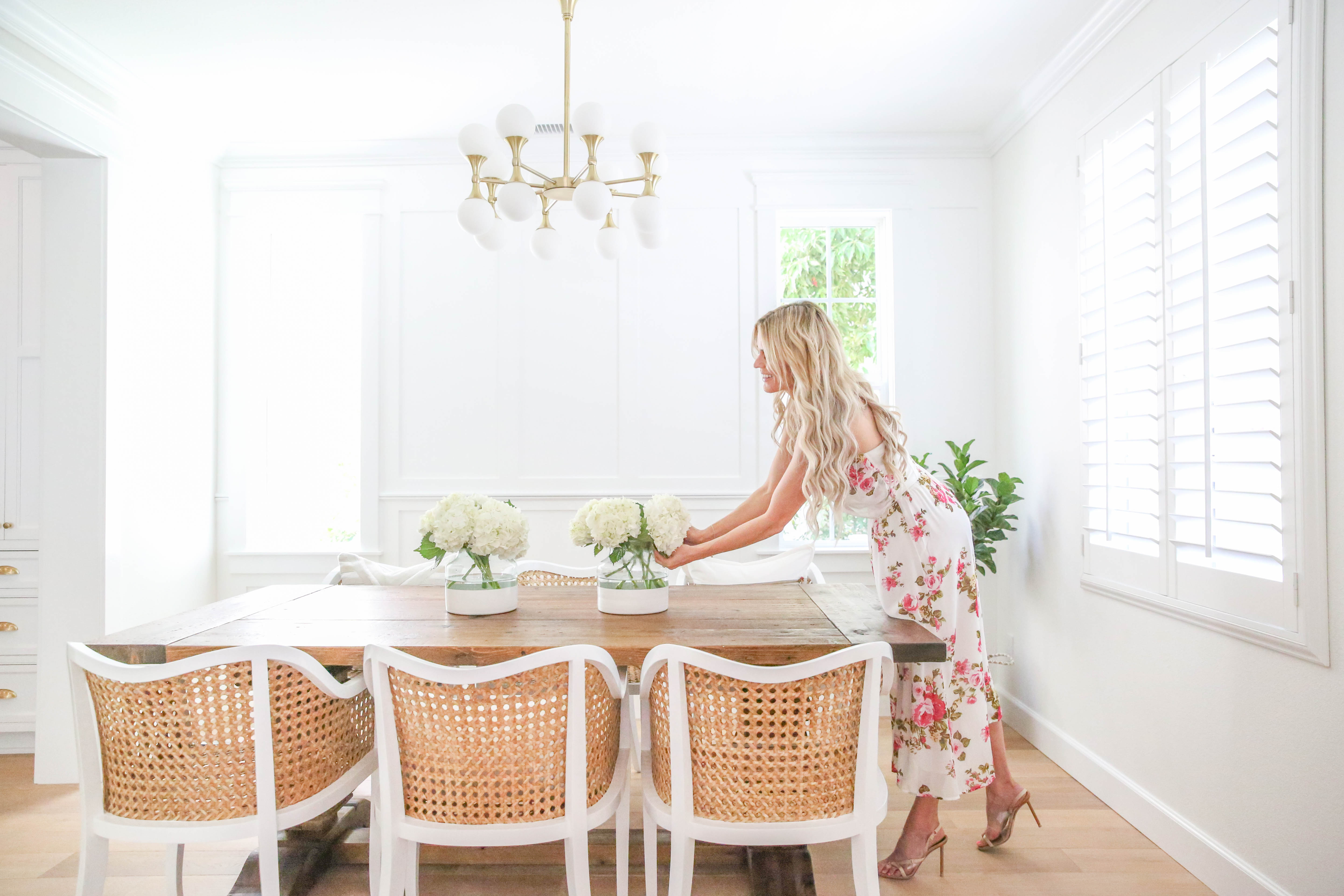
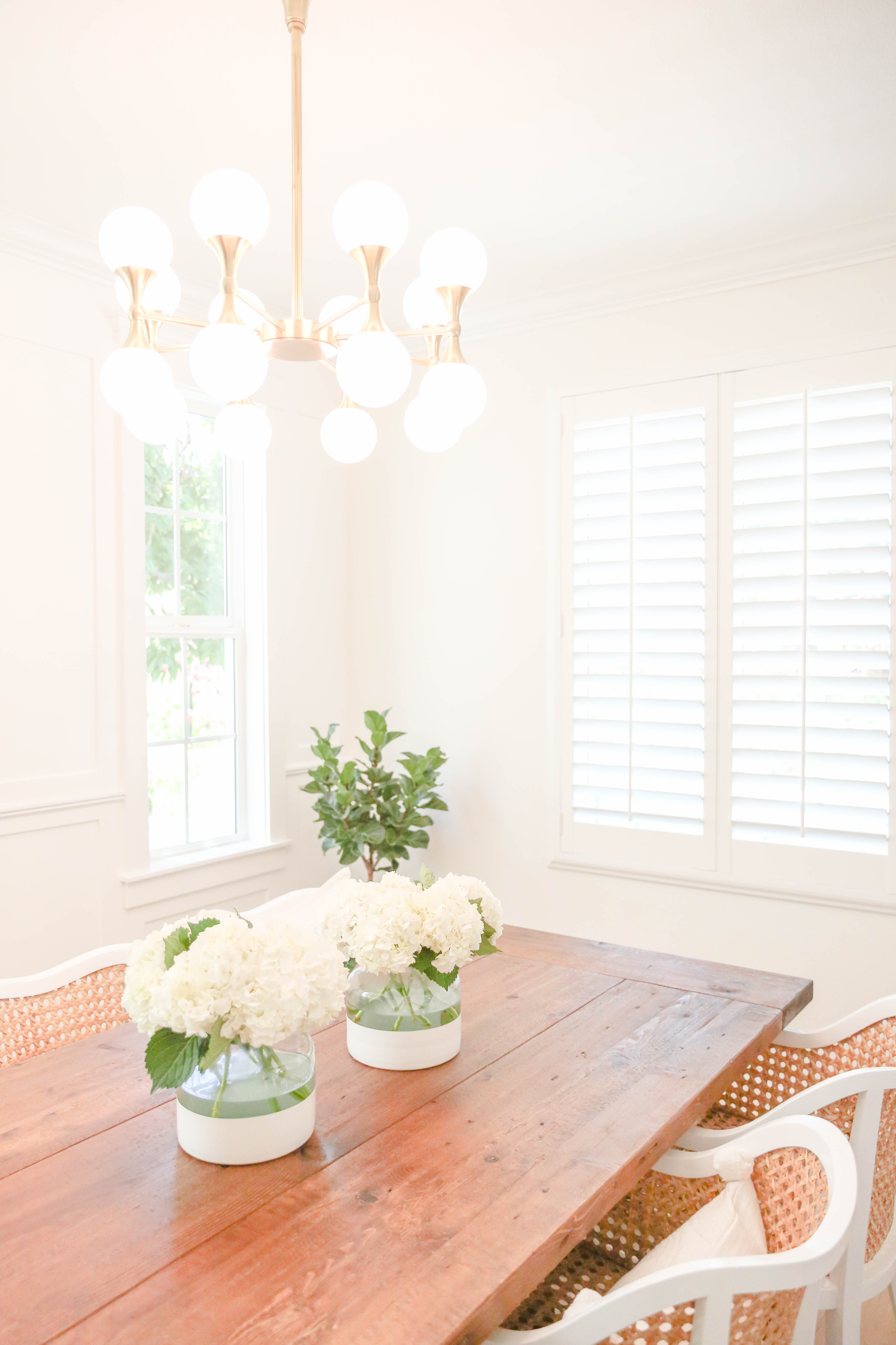
The only item we retained from the original space is our RH trestle dining table. When my husband and I got married, this was the exact style table from our wedding reception so it has very special meaning to us. It was an investment, but we will keep it forever and end up saving money in the long run. One thing I did immediately when I got this table was seal it. If you use this RH table as is, if you get the tiniest bit of water condensation from a glass it would leave a mark. It’s been years since I’ve sealed my table and it looks just like it did when I got it. And this is after many spilled glasses. #momlife If you want to know more about what I used to seal or have questions, comment below.
Prior to the update, we had upholstered dining chairs which was a total rookie mistake. I mean, we have kids. Come on! We updated to these cane chairs which I first spotted in Monika Hibb’s home. If you guys don’t follow her, you should definitely check her out for beautiful home inspiration. Move over Martha! You can see Monika’s beautiful Instagram here!
I love that the chairs are kid-friendly, and I adore the pops of bright white! If I get bored of the look, I can always add custom seat cushions. We accessorized with a few neutral Serena + Lily pillows (exact ones linked above and below).
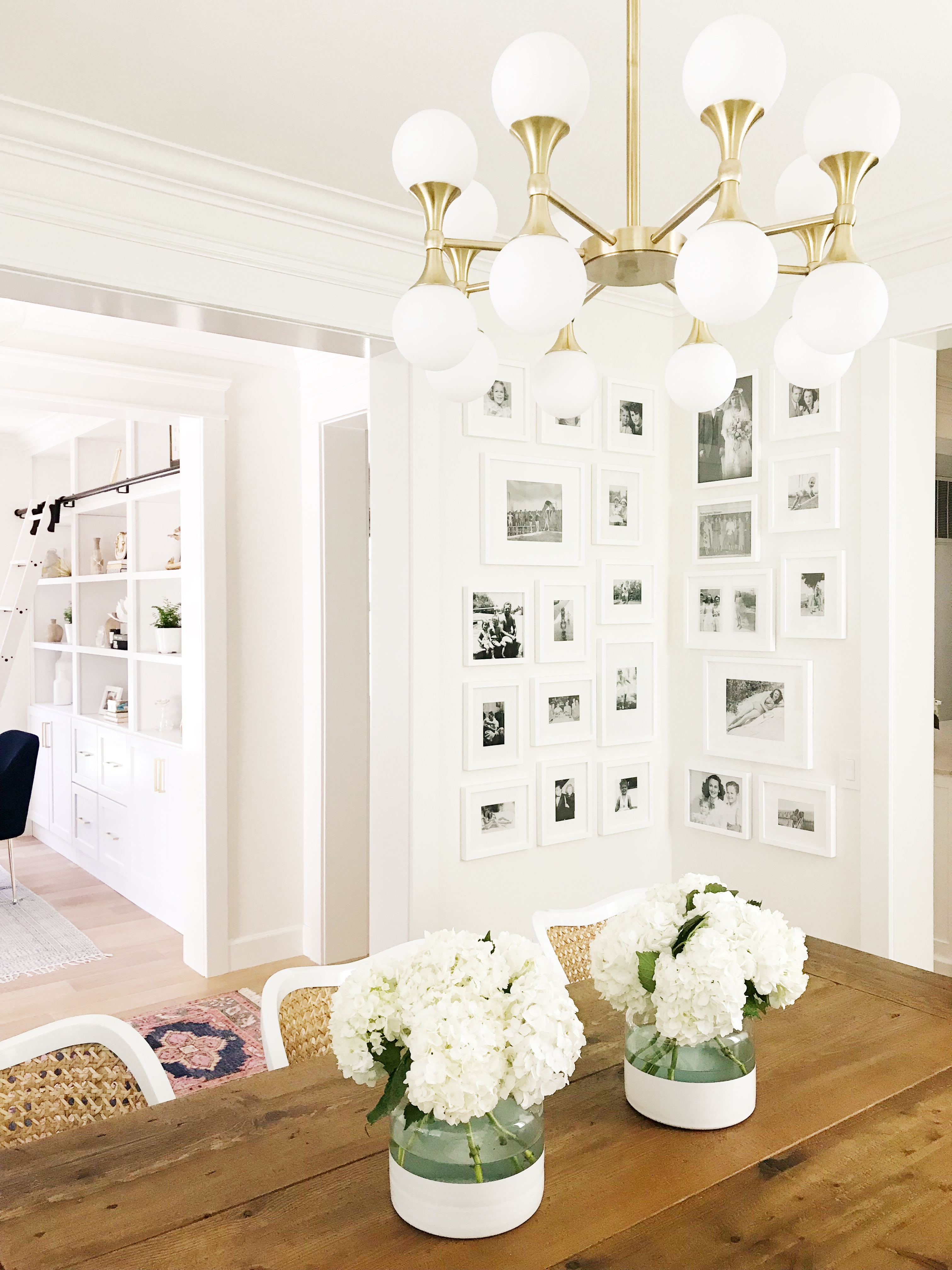
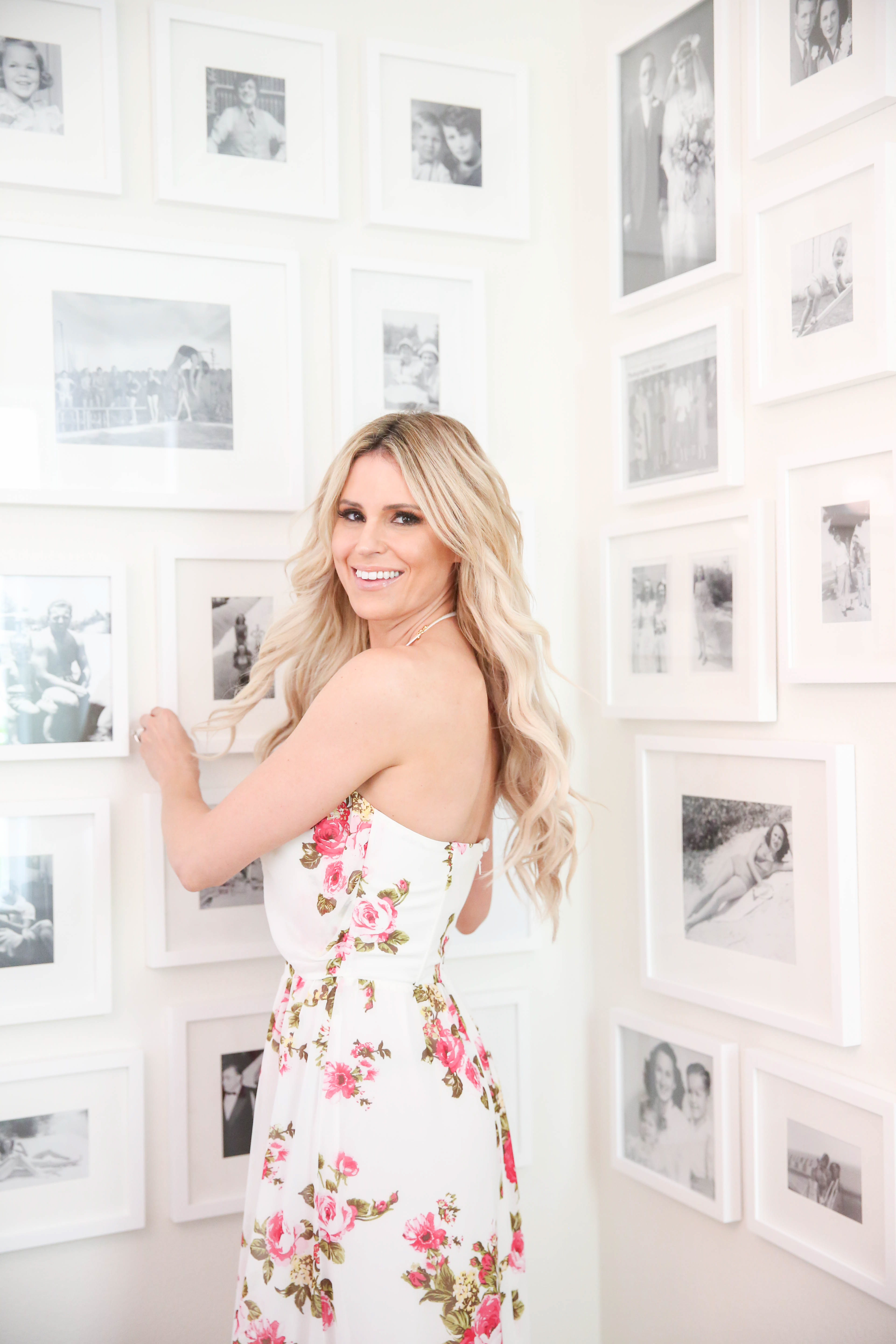
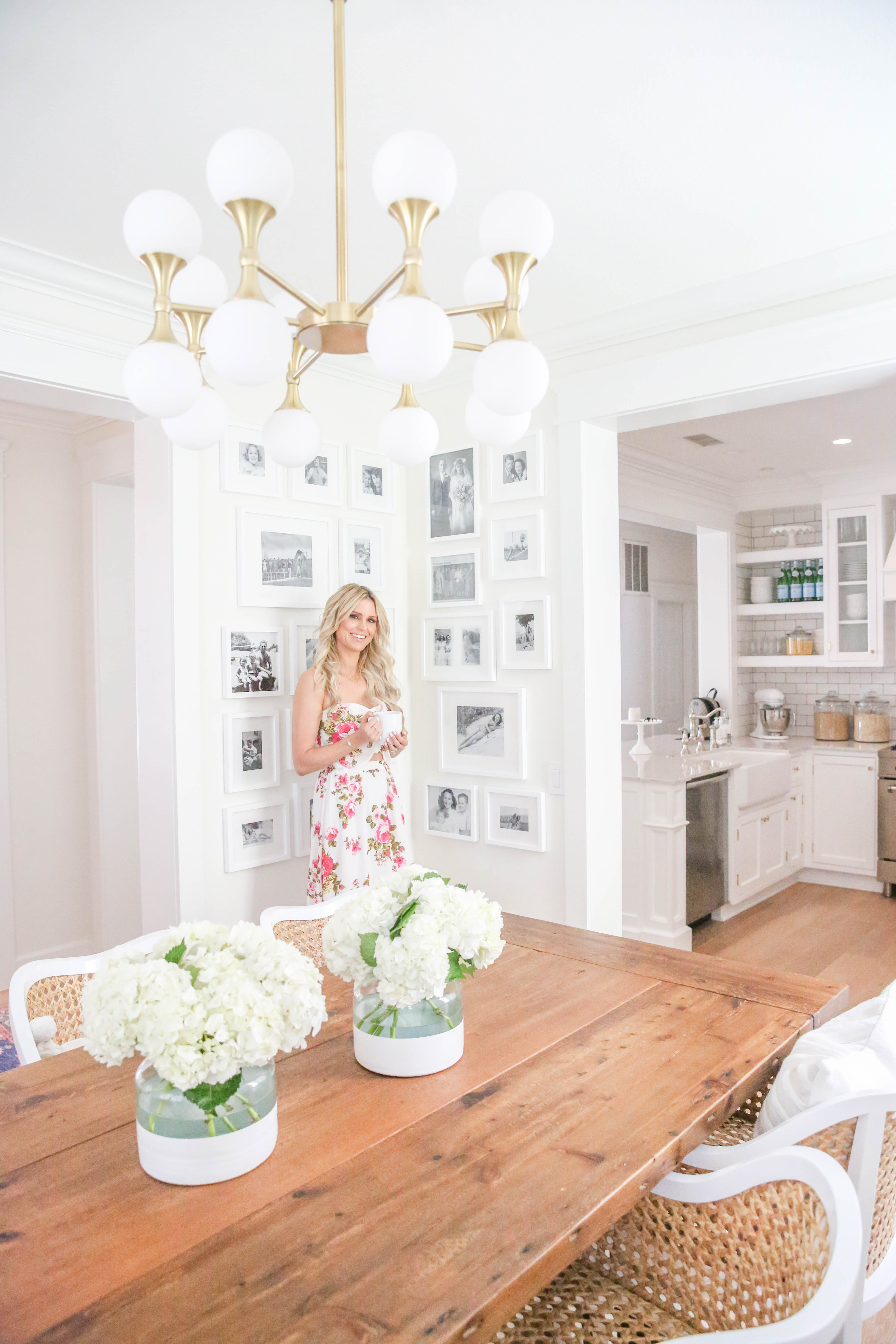
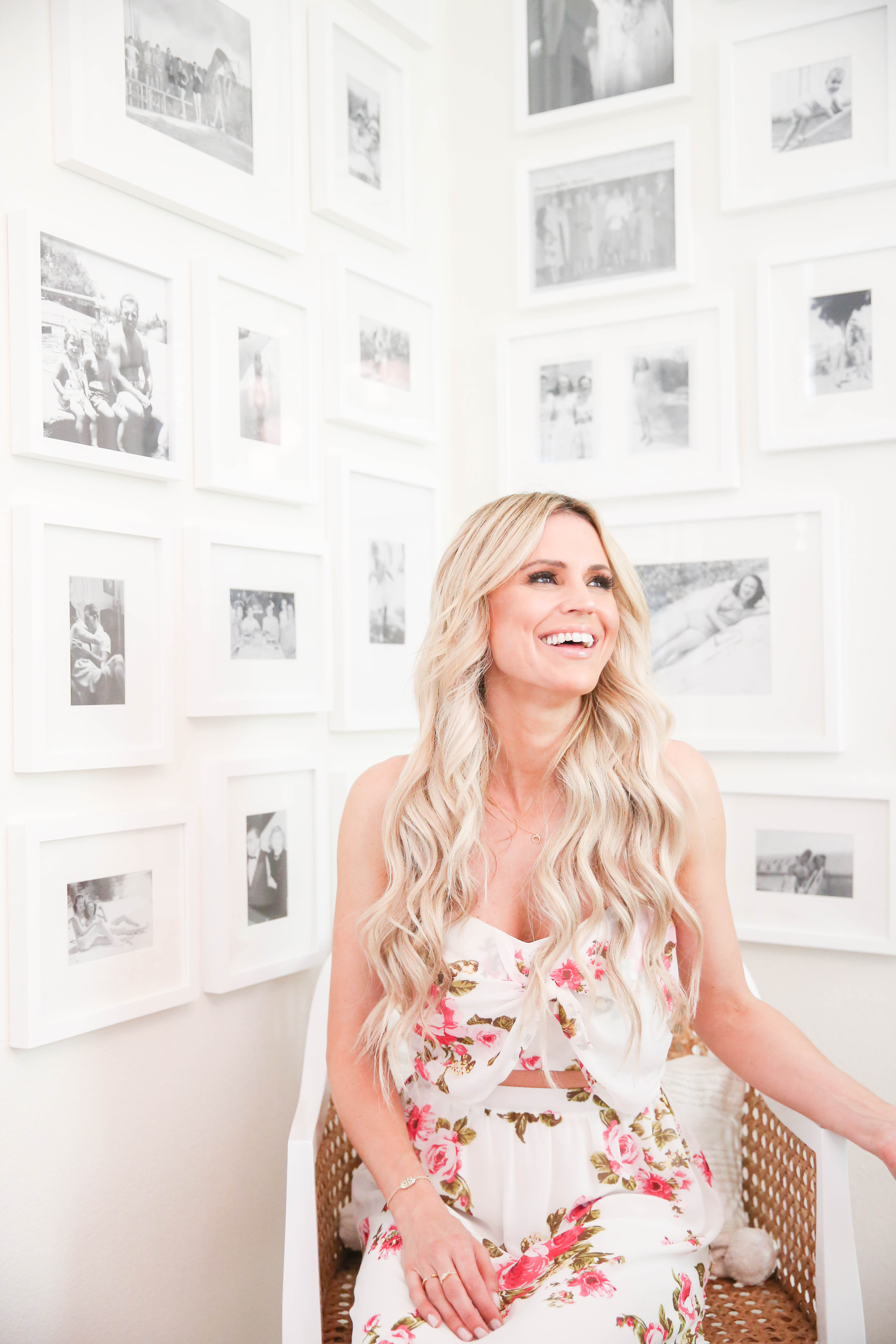
The chandelier and gallery wall are the two standout features. I posted a sneak peek of the gallery wall on Instagram and got tons of questions so wanted to chat with you guys a bit about how we put it together. First I have to say, if my husband and I can do this, ANYONE can lol. We didn’t hire anyone and did it ourselves.
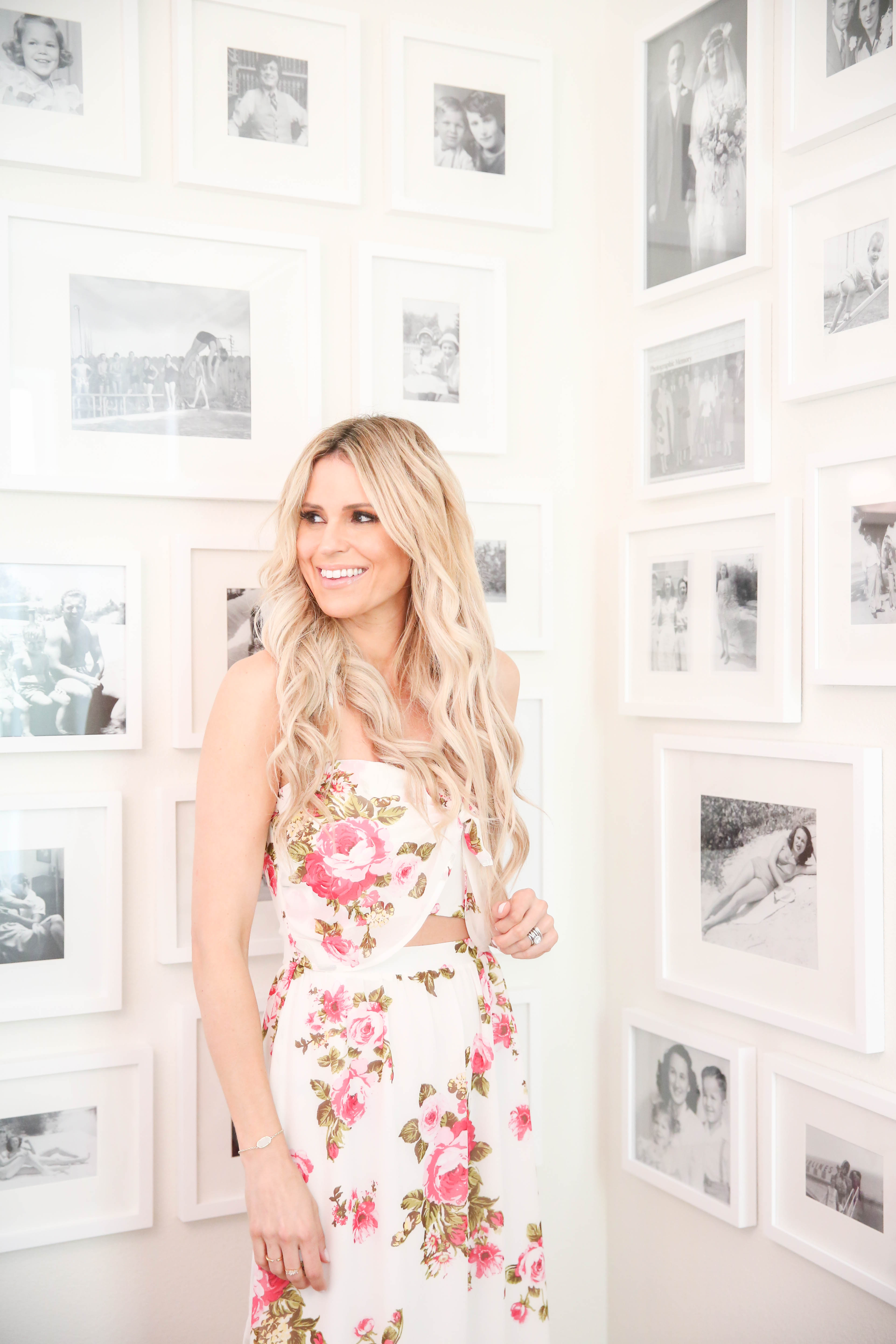
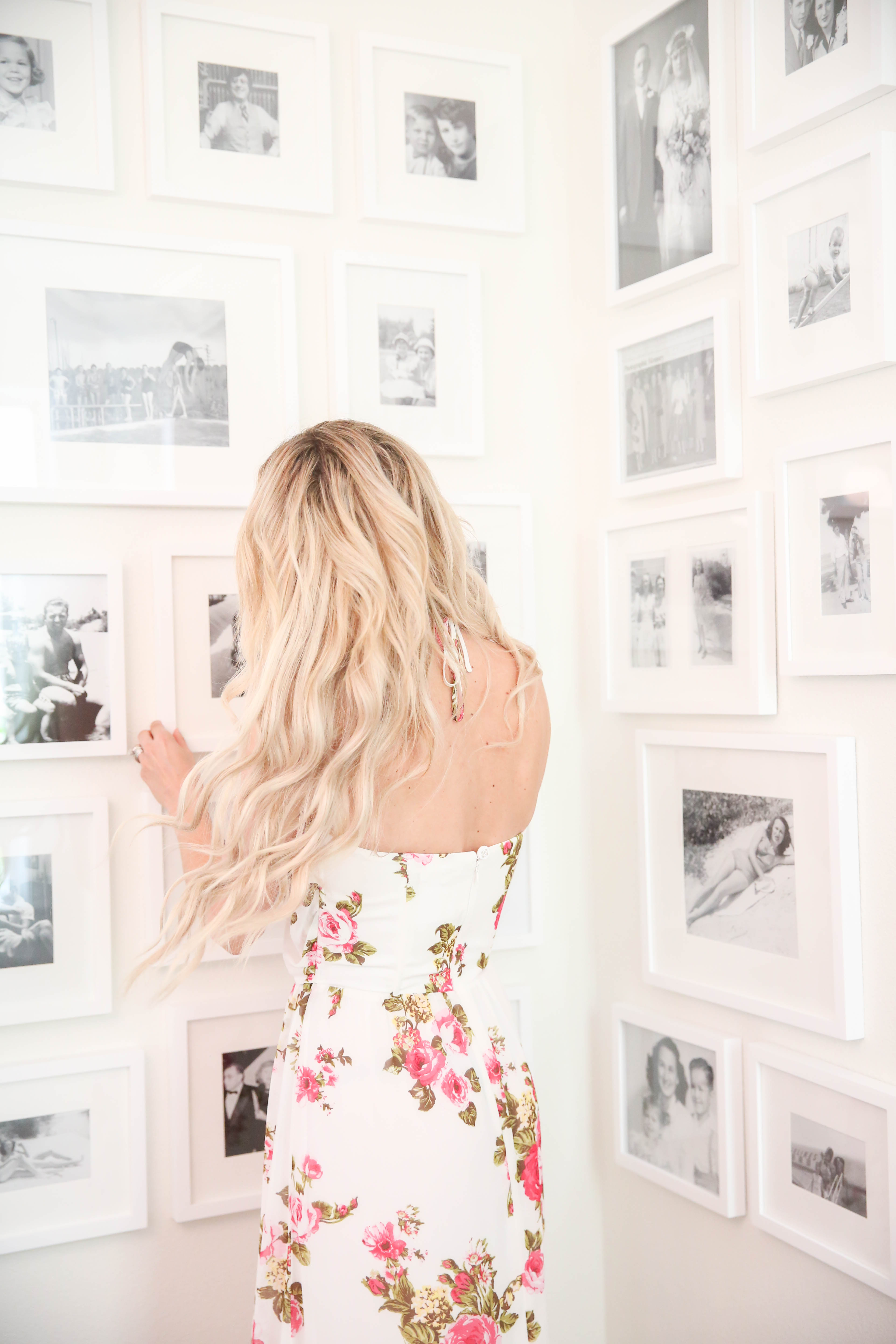
Our gallery wall was inspired by this image on Pinterest (you can follow me on Pinterest here!). I am not a huge fan of family photos in the dining room, but I LOVE the idea of old black and white family photos. It feels like art! These photos were all passed down to me, and I love the idea of our kids being able to see where they came from and our ancestors being remembered. Currently our gallery wall is basically a shrine to my grandma on my mom’s side (she would have LOVED it) and also… I DIE over all her retro swimsuit photos. So cute! Once we get photos from my dad’s side and Chad’s side we will adjust a bit.
I wanted my dining room to feel soft and cohesive so I went with white frames. Our frames are from Pottery Barn, and I used a variety of sizes to keep it interesting. I also enlarged some of the photos and tossed the mat to add more variance. After we finished our gallery wall, my hubby and I had this conversation:
him: “so you know they have apps to create gallery walls, right?”
me: “UM nooooooo I didn’t…. so why did we did we do it this way again? 🙁
I’m telling you guys this so you don’t make the same mistake we did. Try Googling it first!
The is how our process went:
We cut out frame-sized pieces of paper and taped them to the wall using painter’s tape. However, once we got it taped up, the paper would start falling down. But by using the tape, I had a basic idea of what would fit on the wall. I laid out the frames on the floor in the order I thought they would go. Based on the frame sizes we had, it would be impossible to retain the same exact distance between each frame. We decided to try and keep 2 inches between the frames as much as we could get away with it. We felt it was more important to have a clean, consistent border that frames stayed in.
We marked a spot on both walls where we wanted to end the gallery wall- both on top of the wall and near the bottom. On the sides of the wall, we marked off four inches which was our border the frames had to stay in. The painter’s tape worked out well for this job. We basically created a vertical rectangle with the tape that the frames had to stay in (don’t forget to use a level!).
It took us a full day to finish the project and three more trips to Pottery Barn for more frames.
I can see the dining room from my home office (take a peek into my home office here), and I love how it looks and feels. The only thing I would still like to do is add two tall chairs to both ends of the table. But maybe I will wait until Max is a little older. 😉
A big THANK YOU to Hudson Valley Lighting for sponsoring this post. All thoughts and opinions are my own.